Google Revamps Gmail; What's New?

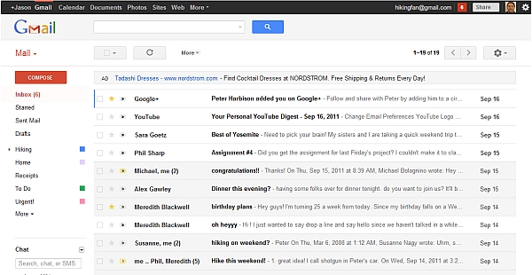
Search giant Google has finally revamped Gmail after showing a preview of its new look way back in July. Let's have a look at what's changed and what is new.
Streamlined conversations
Conversation view has been redesigned to better help users read through their email threads and users can now see profiles pictures for their contacts.

Elastic density
Since Gmail is used in a variety of devices with different screen sizes, now the spacing between elements on the screen will automatically change based on the kind of display being used. Although, users can also choose to manually change the density from the Settings menu.
New HD themes

A new set of high resolution themes (with imagery provided by iStockphoto) have been added and most of the old favourites as well and the user's theme will be automatically carried over to the new look.
Smarter navigation
The navigation panel on the left will keep labels and chat contacts in view at all times. It is also more customizable in the sense that users can resize the labels and chat areas if they want to see more or hide the chat area entirely via the chat icon in the lower left. Users can also use the arrow keys to navigate around the interface.

Better search
Users can access a new advanced search panel by clicking the dropdown in the search box that makes it easier and faster to find exactly what you are looking for. Users can also use the same panel to create a filter from any search.

"We are excited to finally share Gmail's new look with you. We will be bringing these changes to everyone soon, but if users would like to make the switch right away, we are rolling out a Switch to the new look link in the bottom-right of Gmail over the next few days," wrote Jason Cornwell, User Experience Designer at Google in a blog post.

The company recently updated Google Reader with a new interface and theme (among others) and integrated it deeper with Google+ by making many of Reader's social features available via Google+.
Our take
One of the drawbacks of the new Gmail is that the amount of content that can be viewed at one go has reduced considerably, this in turn forces the users to scroll a lot more than usual. The chat window has got its own scroll feature which is a good thing since now you don't have to scroll down the whole page to look at the contacts that are available for chat.

Also, the new advanced search panel provides detailed search options and the overall working speed of Gmail has also increased. The overall feel is better but takes time getting used to; especially since the options buttons no longer have names describing their functions as was the case in the earlier version.
